
Hamilton Wood Type Rebrand
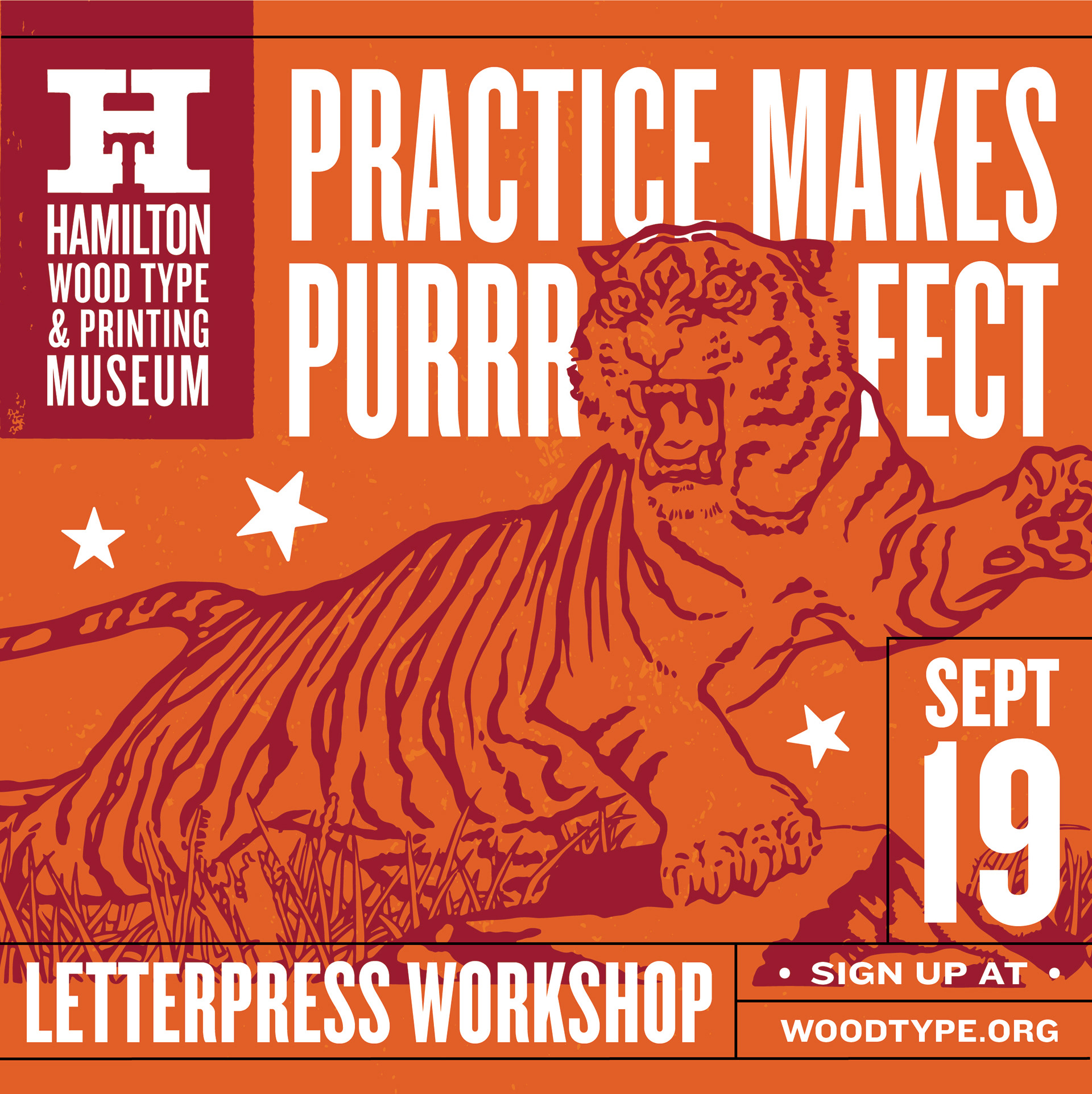
After 20 years of operation, the Hamilton Wood Type & Printing Museum made the decision to update their brand and logos. The museum has an iconic logo mark, using a slab serif "H", but it never had a fully formed and recognizable brand identity. Ultimately the museum wanted something that could tell their story and reflect the exciting and creative experiences happening at the museum every day.
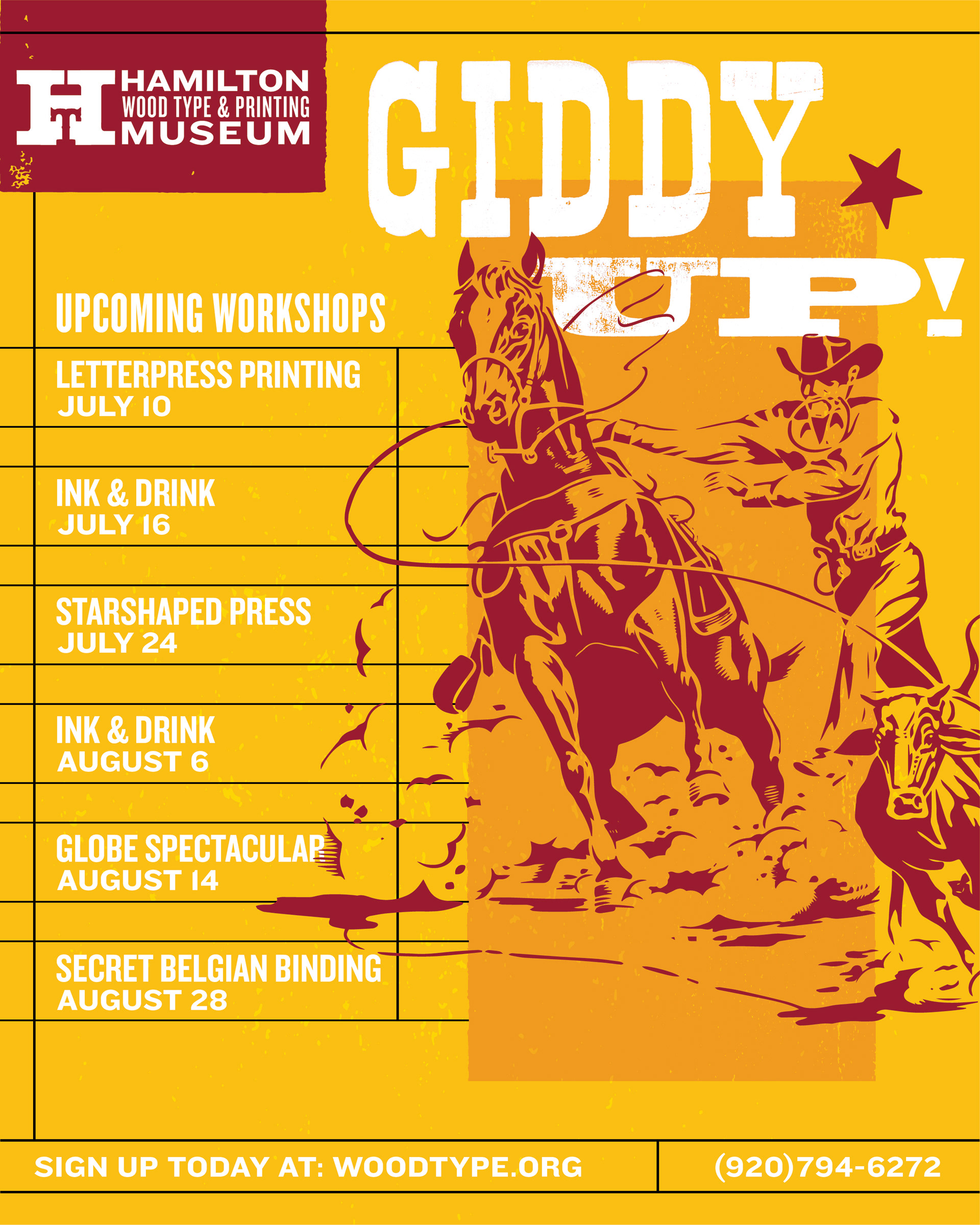
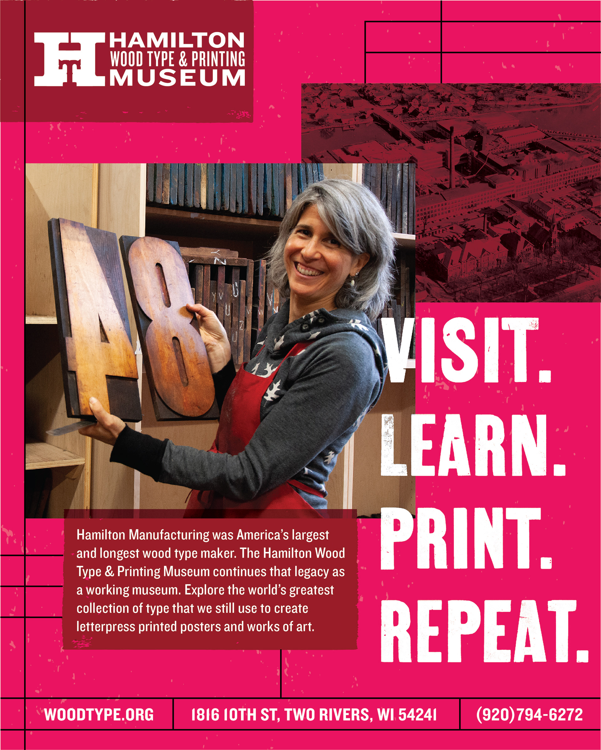
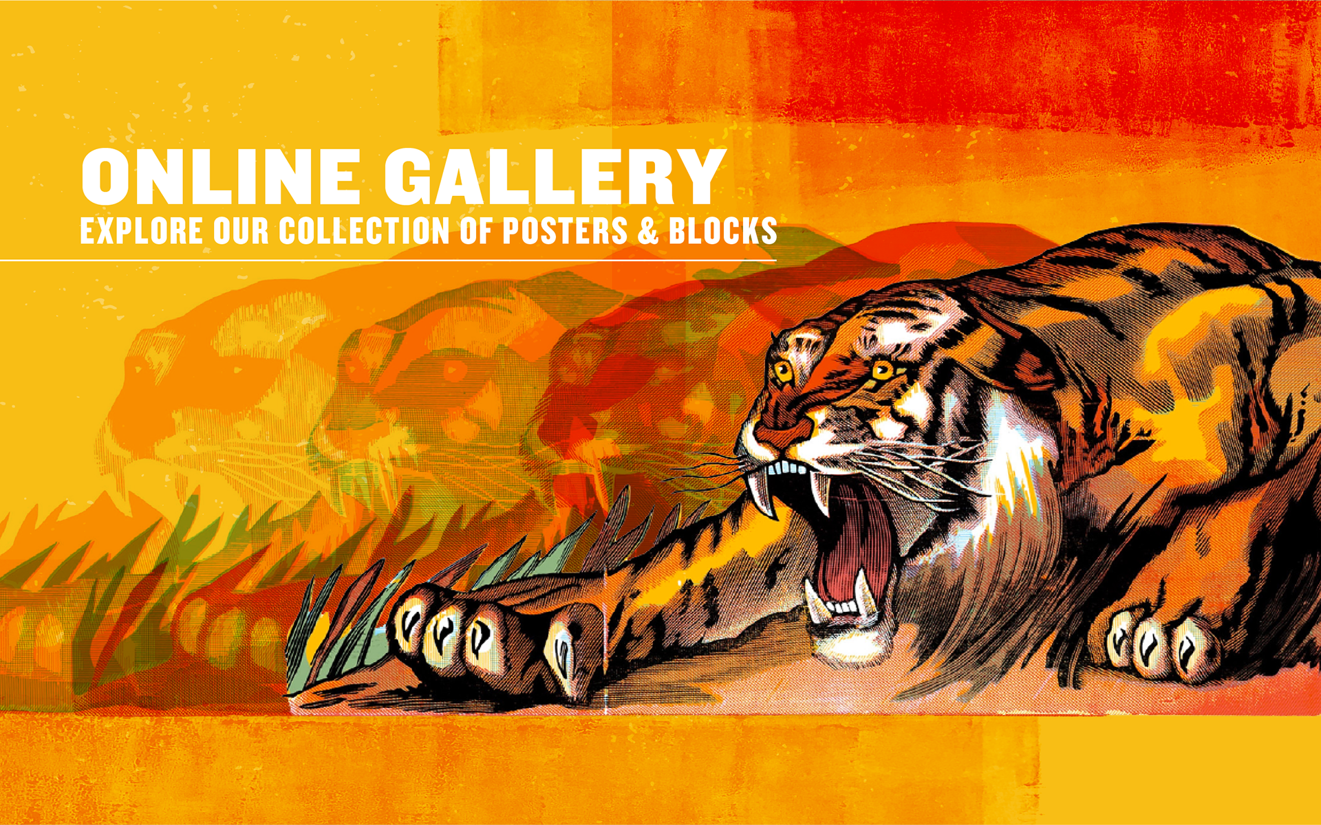
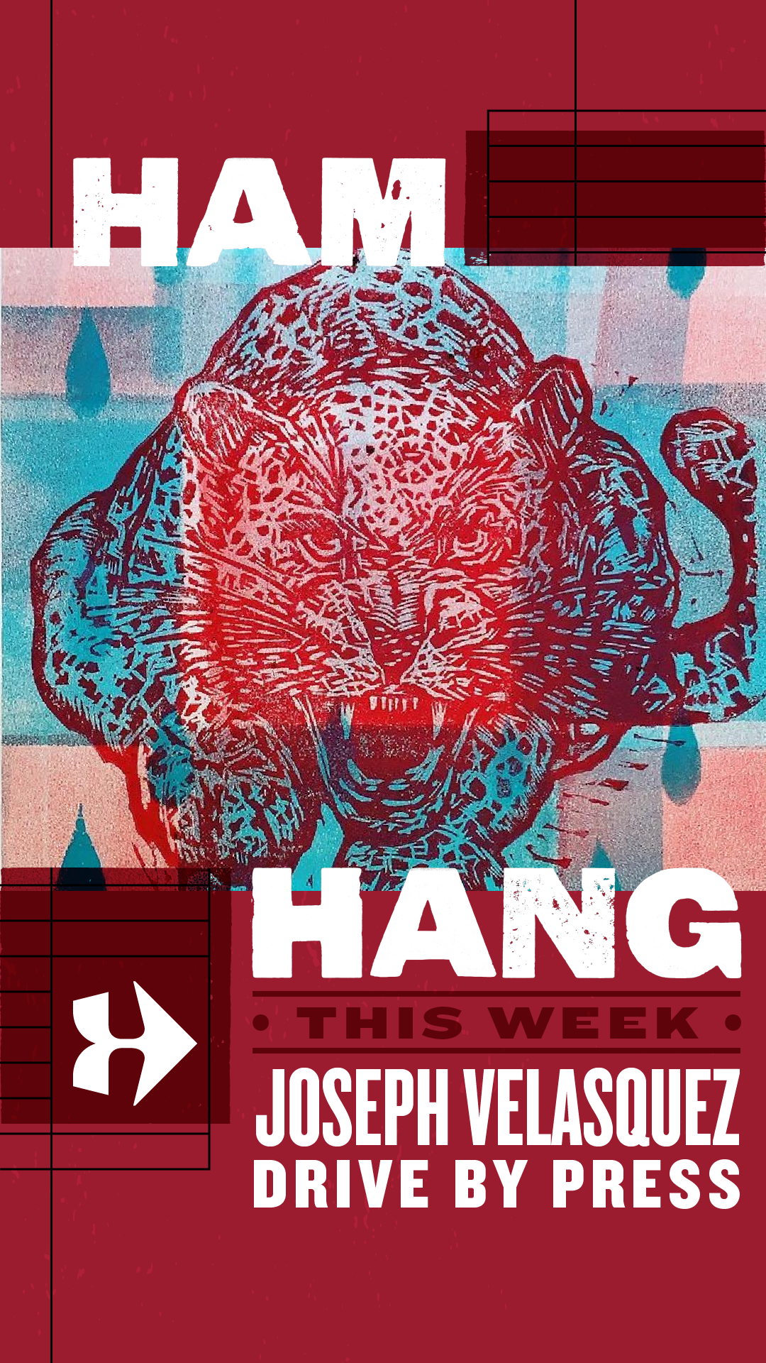
Program Officer Stephanie Carpenter created an initial style guide that utilized the museum's collection of wood type, woodcuts, and textures taken directly from letterpress printing. Stephanie asked for my feedback on it and thoughts on what the brand could be. Eventually I was brought in, creating designs based on her style guide and further expanding and defining the brand. I worked on a large variety of designs between social media posts, animations, print ads, correspondence, website graphics, and signage. This all led to me creating a brand style guide for staff, volunteers, and interns to work within, but with enough flexibility and creative freedom to work on any variety of future applications.
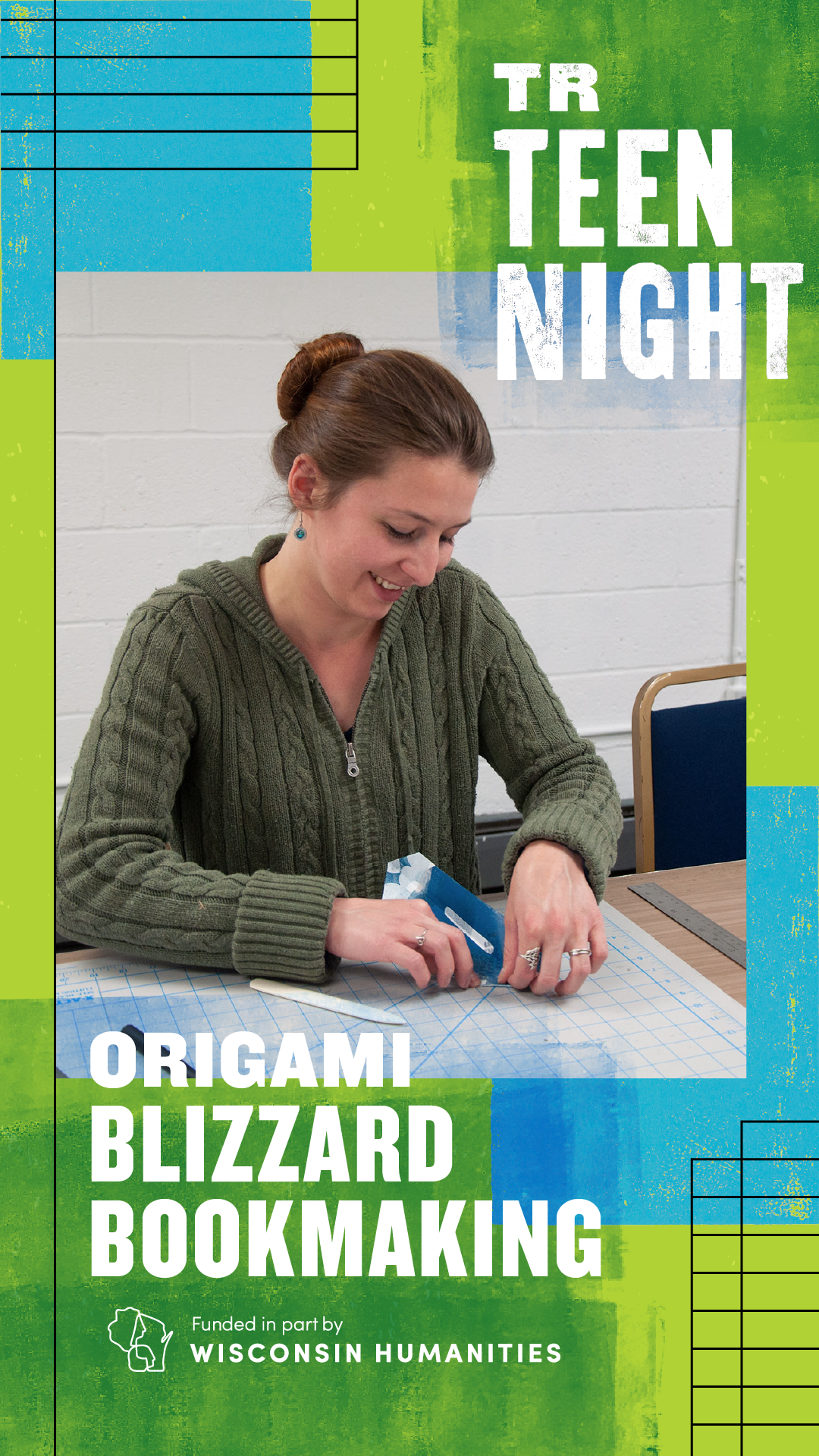
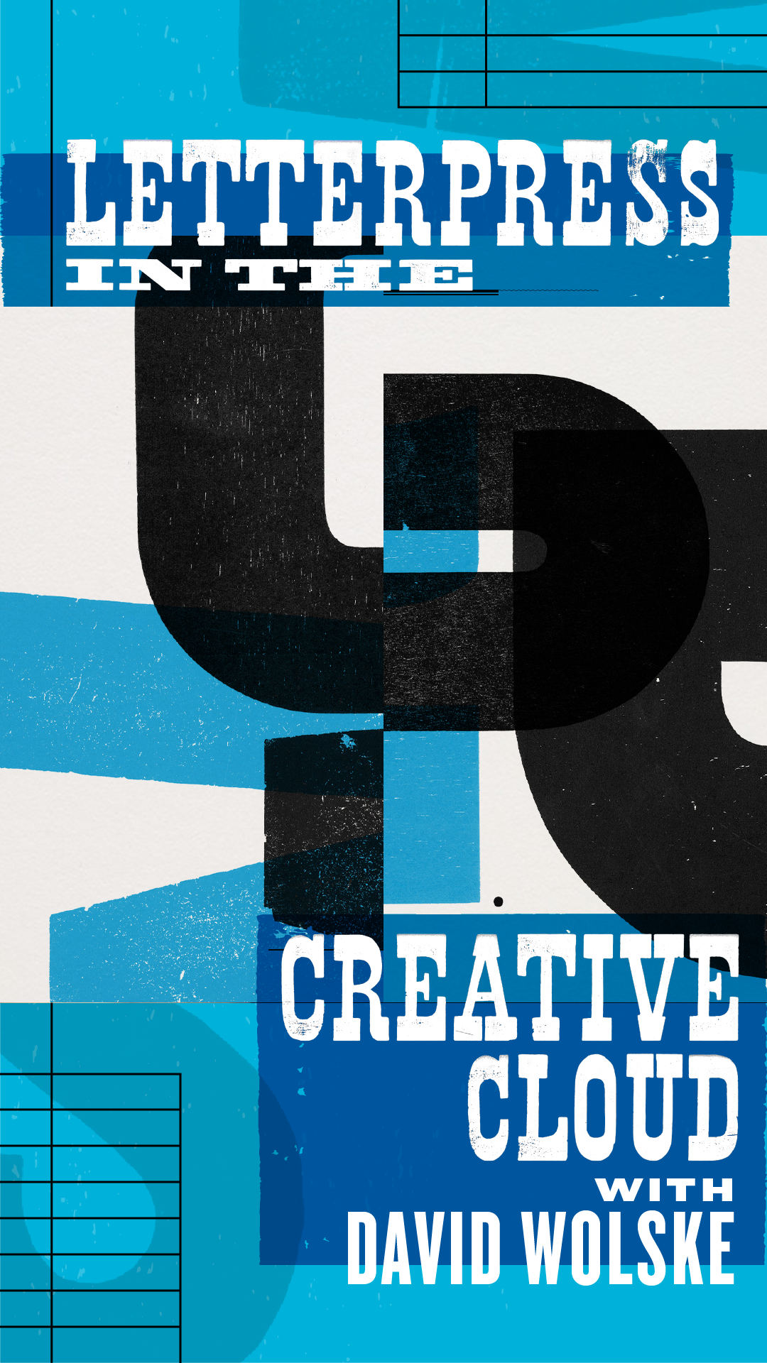
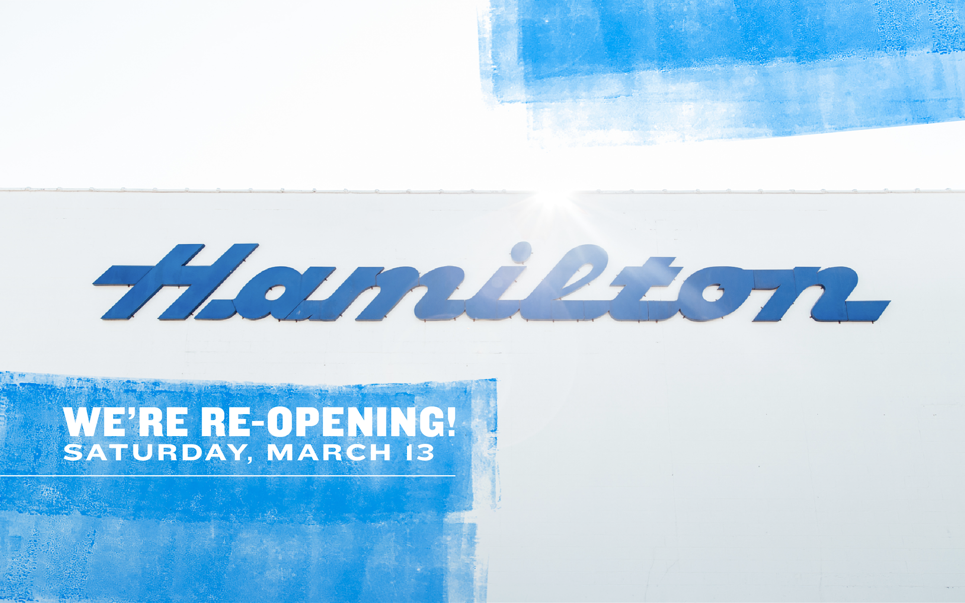
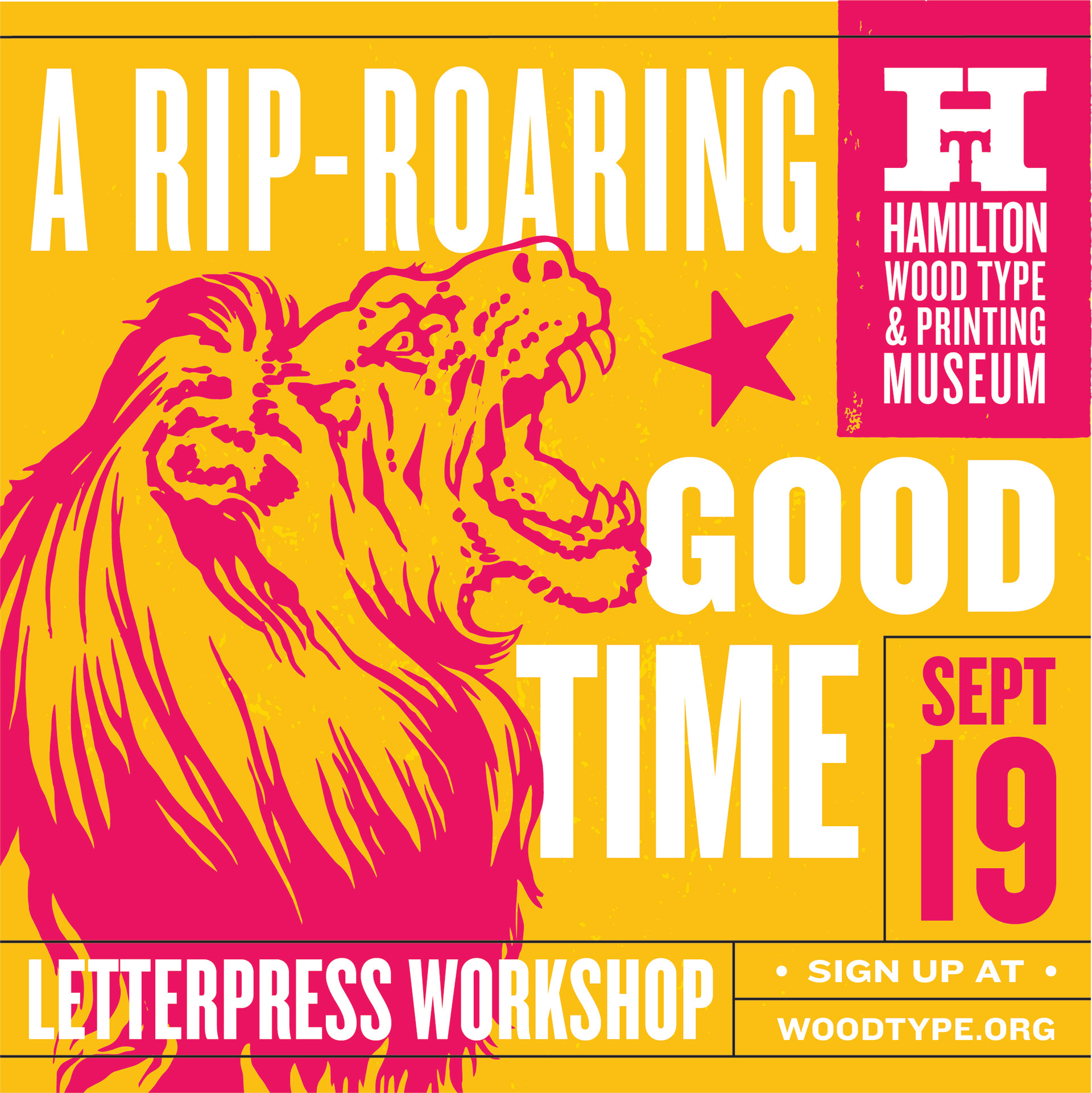

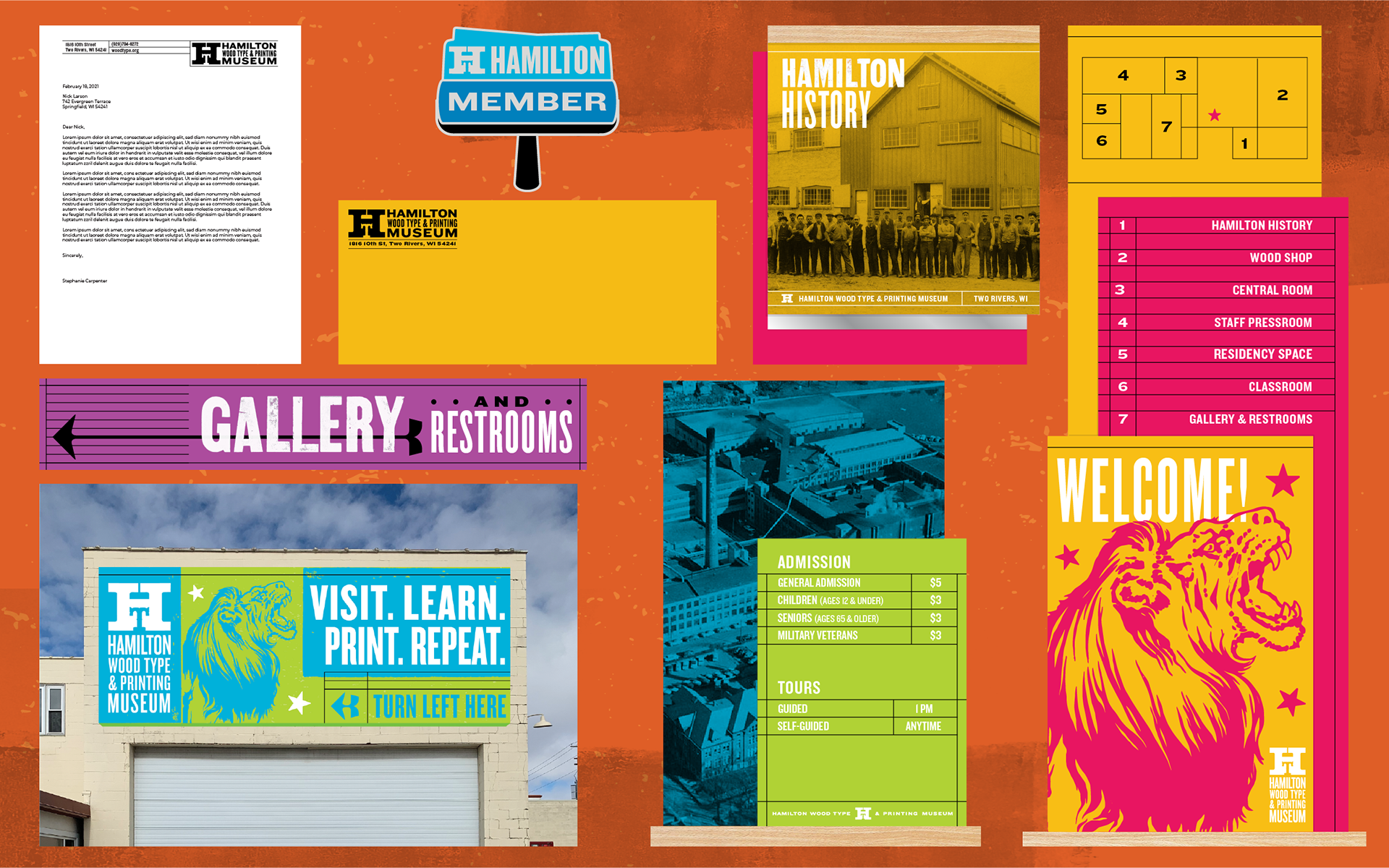
Concepts for various museum signage, correspondence, and membership perks.